Euromet refines its communication strategy for 2018 and changes logo color of . In fact the details in the logo will no longer be green, but BLUE. We are pleased to present the new logo.
Moreover, the color of payoff “STANDING INNOVATION” becomes BLU, as well as some details inside the site.
Blue on the web and in technology world
In the technological, digital and social fields, many Internet sites are characterized by shades ranging from blue to light blue. The colors most used by the 100 most popular brands in the world are blue (in 33% of cases). Among these we can mention Skype, Linkedin and also Google and Tumblr.
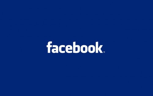
Among all, Facebook and its color are the best known. It has chosen BLUE too. Perhaps, initially by pure chance or better by a contingent necessity. In fact, Zuckerberg, patron of the social network, says that he chose blue as the color of his brand because he is colorblind. The case then became an absolutely winning choice.
Why did we choose BLUE?
Our choice was not a case. As part of Euromet’s marketing and branding strategy, every detail has its importance and every choice is weighted and planned. In this sense, color could not be separated from the science of colors and therefore from their meaning.

The blue, experts explain, evokes security, reliability, serenity and productivity. These are also our values. On one hand, they represent our safe and reliable product in terms of materials and workmanship, and on the other, the way we work and relate to the end customer with serenity and productivity.
Blue also recalls our Italian spirit. Why blue recalls our Italian? Because blue is our national football team which, first of all, is a symbol of Italianness in the world.
In the same way we are among the brands that make Italianity a pride, precisely because our products are “Made only in Italy” in production and design.